Overview
Buttons
There are 4 levels of buttons, form primary to quaternary:
[ R10.Button.primary []
    { label =
        row [ spacing 15, centerX ]
            [ R10.Paragraph.normal [] [ text "Primary button" ]
            , R10.Svg.Icons.cart_f [] (R10.Color.Svg.fontButtonPrimary theme) 18
            ]
    , libu = R10.Libu.Li "https://r10.netlify.app"
    , theme = theme
    }
, R10.Button.secondary []
    { label = R10.Paragraph.normal [] [ text "Secondary button" ]
    , libu = R10.Libu.Li "https://r10.netlify.app"
    , theme = theme
    }
, R10.Button.tertiary []
    { label =
        R10.Paragraph.normal []
            [ text "Tertiary "
            , el (R10.Link.attrs theme) <| text "button"
            ]
    , libu = R10.Libu.Li "https://r10.netlify.app"
    , theme = theme
    }
, row [ width fill ]
    [ R10.Button.quaternary [ moveLeft 13 ]
        { label = R10.Paragraph.normal [] [ text "Quaternary button" ]
        , libu = R10.Libu.Li "https://r10.netlify.app"
        , theme = theme
        }
    , R10.Button.quaternary [ alignRight, moveRight 13 ]
        { label = R10.Paragraph.normal [] [ text "Quaternary button" ]
        , libu = R10.Libu.Li "https://r10.netlify.app"
        , theme = theme
        }
    ]
]
Font sizes
Font size: XX Large
Font size: X Large
Font size: Large
Font size: Normal
Font size: Small
Font size: X Small
Font size: XX Small
[ el [ R10.FontSize.xxlarge ] <| text "Font size: XX Large"
, el [ R10.FontSize.xlarge ] <| text "Font size: X Large"
, el [ R10.FontSize.large ] <| text "Font size: Large"
, el [ R10.FontSize.normal ] <| text "Font size: Normal"
, el [ R10.FontSize.small ] <| text "Font size: Small"
, el [ R10.FontSize.xsmall ] <| text "Font size: X Small"
, el [ R10.FontSize.xxsmall ] <| text "Font size: XX Small"
]
Forms
Forms have two different styles: Outlined and Filled:
Outlined
Binary Switch
Helper Text
Checkbox
User ID
Required
Password
Required
Radio
Required
Filled
Binary Switch
Helper Text
Checkbox
User ID
Required
Password
Required
Radio
Required
Forms are defined by two things: Configuration and State. This is an example of configuration:
[ R10.Form.entity.field
    { id = "userId"
    , idDom = Nothing
    , type_ = R10.FormTypes.inputField.textUsername
    , label = "User ID"
    , helperText = Nothing
    , requiredLabel = Just "Required"
    , validationSpecs =
        Just
            { showPassedValidationMessages = False
            , hidePassedValidationStyle = True
            , validationIcon = R10.FormTypes.NoIcon
            , validation =
                R10.Form.validation.allOf
                    [ R10.Form.validation.required
                    , R10.Form.validation.minLength 6
                    , R10.Form.validation.maxLength 128
                    , R10.Form.validation.withMsg
                        { ok = "INVALID_FORMAT_INVALID_CHARACTERS"
                        , err = "INVALID_FORMAT_INVALID_CHARACTERS"
                        }
                        (R10.Form.validation.regex "^((?!(/|\\))[\x21-\x7F])+$")
                    ]
            }
    }
]
Translations
To translate some text:
R10.I18n.t language R10.Translations.signInHeader
Where signInHeader is defined as
signInHeader : Translations
signInHeader =
    { key = "signInHeader"
    , en_us = "Sign in to your Rakuten account"
    , zh_tw = "會員登入"
    , ja_jp = "楽天会員 ログイン"
    ...
    }
Okaimono Panda
R10.Okaimonopanda.view
    { mouse = mouse
    , screen = windowSize
    }
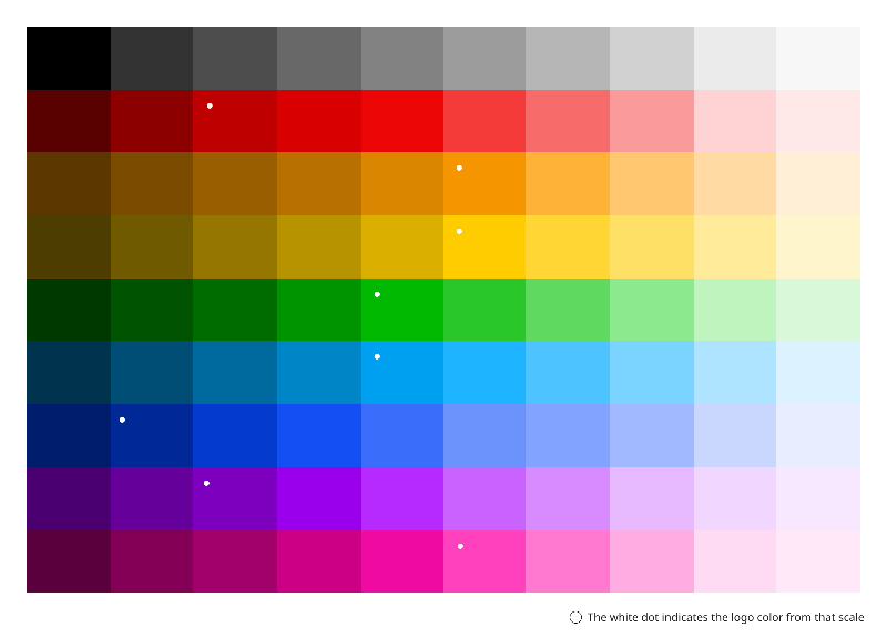
Palettes
Palette Base
Light Mode
Background
#ebebeb
Hard coded as #f0f0f0
Font
#000000
Hard coded as #000000
Font Reversed
#ffffff
Hard coded as #ffffff
Font Link
#00a0f0
Hard coded as #00a0f0
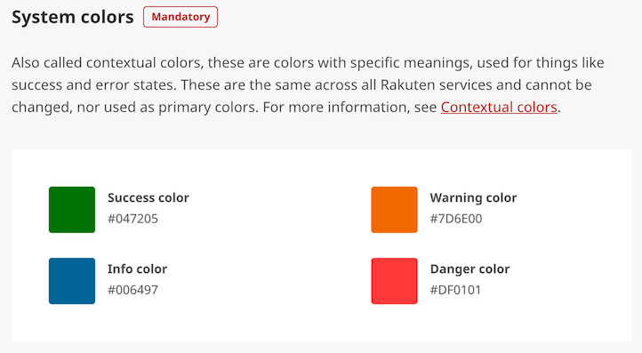
Success
#047205
Hard coded as #047205
Error
#df0101
Hard coded as #df0101
Dark Mode
Background
#121212
Hard coded as #121212
Font
#ffffff
Hard coded as #ffffff
Font Reversed
#000000
Hard coded as #000000
Font Link
#1493d3
Converted from light mode using `R10.Color.Utils.fromLightToDark`
Success
#2d952e
Same as light mode but lighten (0.15) and desaturate (0.4)
Error
#cf4444
Same as light mode but lighten (0.1) and desaturate (0.4)
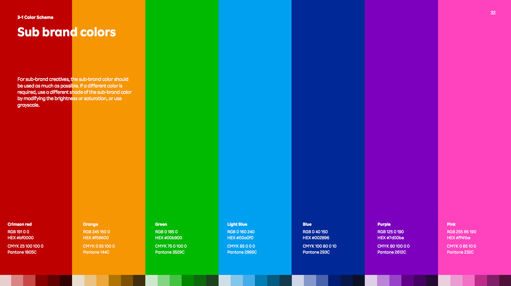
Palette Primary
Light Mode
Crimson Red
#bf0000
Hard coded as #bf0000
Pink
#ff008c
Hard coded as #ff008c
Purple
#7d00be
Hard coded as #7d00be
Blue
#002896
Hard coded as #002896
Light Blue
#00a0f0
Hard coded as #00a0f0
Green
#00b900
Hard coded as #00b900
Orange
#f59600
Hard coded as #f59600
Yellow
#ffcc00
Hard coded as #ffcc00
Dark Mode
Crimson Red
#a81010
Converted from light mode using `R10.Color.Utils.fromLightToDark`
Pink
#e01584
Converted from light mode using `R10.Color.Utils.fromLightToDark`
Purple
#7310a7
Converted from light mode using `R10.Color.Utils.fromLightToDark`
Blue
#0c2c84
Converted from light mode using `R10.Color.Utils.fromLightToDark`
Light Blue
#1493d3
Converted from light mode using `R10.Color.Utils.fromLightToDark`
Green
#0fa30f
Converted from light mode using `R10.Color.Utils.fromLightToDark`
Orange
#d78c14
Converted from light mode using `R10.Color.Utils.fromLightToDark`
Yellow
#e0b715
Converted from light mode using `R10.Color.Utils.fromLightToDark`
Palette Derived
Light Mode
Background Normal
#ebebeb
The same as the base `Background`.
Surface
#f8f8f8
A color for surfaces above the background, 1dp (See https://material.io/design/color/dark-theme.html#anatomy)
Surface 2dp
#ffffff
A color for surfaces above the background, 2dp (See https://material.io/design/color/dark-theme.html#anatomy)
Font Medium Emphasis
#00000099
A color used for fonts when they carry a less important message. It is made changing the alpha channel to 0.6 so the result is that is going to be more similar to the background.
Primary
#117bb4
Just the primary color
Primary Variant
#32719366
Like the primary, but more subtle
Success
#047205
same as base color `Succes`
Error
#df0101
The same as the base `Error` color
Logo
#117bb4
Logo color is the same as primary color in light mode and `highEmphasis` in dark mode
Font Medium Emphasis With Maximum Contrast
#ffffff99
A `mediumEmphasis` color for less important text that goes above a primary color
Font Link
#00a0f0
The same as the base `FontLink` color
Font High Emphasis With Maximum Contrast
#ffffffde
A `highEmphasis` color for regular text that goes above a primary color
Font High Emphasis
#000000de
The default color for text. It is made changing the alpha channel to 0.87.
Debugger
#00a0f0
The same as the base `LightBlue` color
Border
#00000033
Color for borders derived from the base `Font` changing the alpha channel to 0.2
Background Phone Dropdown
#ebebeb
A special background for the phone dropdown. On `light` mode is the same as the base `Background` but in `dark` mode is lighter 0.05 compared to the base `Background` so that it became visible.
Background Input Field Text
#dedede
A special background color for input fields. In `light` mode is sligthly darken than normal background. In `dark` mode is sligthly lighten than normal background.
Background Button Primary Over
#2598d5
The mouse-over color for the primary button obtained adding a `scaleHsl` transformation to the primary color.
Background Button Primary Disabled Over
#c6c6c6
The mouse-over color for the disabled primary button obtained adding a `scaleHsl` transformation to the primary color that has been already transformed to change it to disabled.
Background Button Primary Disabled
#b8b8b8
The background color of disabled primary button obtained. This is made making it ligher on Light mode and darker on Dark mode.
Background Button Primary
#117bb4
Just the primary color, extracted from the `theme`.
Background Button Minor Over
#d7d7d7
Background of minors buttons based on the normal background color. Just making it lighter in Dark mode and darker in Light mode
Dark Mode
Background Normal
#121212
The same as the base `Background`.
Surface
#1f1f1f
A color for surfaces above the background, 1dp (See https://material.io/design/color/dark-theme.html#anatomy)
Surface 2dp
#2c2c2c
A color for surfaces above the background, 2dp (See https://material.io/design/color/dark-theme.html#anatomy)
Font Medium Emphasis
#ffffff99
A color used for fonts when they carry a less important message. It is made changing the alpha channel to 0.6 so the result is that is going to be more similar to the background.
Primary
#1e729f
Just the primary color
Primary Variant
#386a8666
Like the primary, but more subtle
Success
#2d952e
same as base color `Succes`
Error
#cf4444
The same as the base `Error` color
Logo
#ffffffde
Logo color is the same as primary color in light mode and `highEmphasis` in dark mode
Font Medium Emphasis With Maximum Contrast
#ffffff99
A `mediumEmphasis` color for less important text that goes above a primary color
Font Link
#1493d3
The same as the base `FontLink` color
Font High Emphasis With Maximum Contrast
#ffffffde
A `highEmphasis` color for regular text that goes above a primary color
Font High Emphasis
#ffffffde
The default color for text. It is made changing the alpha channel to 0.87.
Debugger
#1493d3
The same as the base `LightBlue` color
Border
#ffffff33
Color for borders derived from the base `Font` changing the alpha channel to 0.2
Background Phone Dropdown
#1f1f1f
A special background for the phone dropdown. On `light` mode is the same as the base `Background` but in `dark` mode is lighter 0.05 compared to the base `Background` so that it became visible.
Background Input Field Text
#1f1f1f
A special background color for input fields. In `light` mode is sligthly darken than normal background. In `dark` mode is sligthly lighten than normal background.
Background Button Primary Over
#338fc1
The mouse-over color for the primary button obtained adding a `scaleHsl` transformation to the primary color.
Background Button Primary Disabled Over
#6a6a6a
The mouse-over color for the disabled primary button obtained adding a `scaleHsl` transformation to the primary color that has been already transformed to change it to disabled.
Background Button Primary Disabled
#454545
The background color of disabled primary button obtained. This is made making it ligher on Light mode and darker on Dark mode.
Background Button Primary
#1e729f
Just the primary color, extracted from the `theme`.
Background Button Minor Over
#242424
Background of minors buttons based on the normal background color. Just making it lighter in Dark mode and darker in Light mode
Logos & Icons
Logos
authenticator
authenticator_monochrome
r
rakuten
rakutenMarketing
rakutenRagri
rakutenReady
Logos Extra
elm
elm_monochrome
visa
visa_monochrome
americanExpress
americanExpress_monochrome
apple
apple_monochrome
facebook
facebook_monochrome
google
google_monochrome
microsoft
microsoft_monochrome
pcHome24hours
pcHome24hours_monochrome
github
cardVisa
cardMasterCard
cardDiscover
cardJCB
cardAmericanExpress
Icons
arrow_down_l
arrow_left_l
arrow_right_l
arrow_link_l
arrow_up_l
barcode_f
barcode_l
blockquote_left
blockquote_right
browsing_history_f
browsing_history_l
building_f
building_l
bus_f
bus_l
button_chevron_left_f
button_chevron_left_l
button_chevron_right_f
button_chevron_right_l
button_minus_f
button_minus_l
button_plus_f
button_plus_l
calculator_f
calculator_l
calendar_f
calendar_l
campaign_f
campaign_l
car_f
car_l
cart_f
cart_l
change_order_l
check
chevron_left
chevron_right
cloud_f
cloud_l
code_f
code_l
comment_f
comment_l
compare_f
compare_l
coupon_f
coupon_l
credit_card_f
credit_card_l
currency_f
currency_l
delete_f
delete_l
delivery_f
delivery_l
desktop_f
desktop_l
domestic_area_f
domestic_area_l
download_f
download_l
eye_ban_f
eye_ban_l
eye_f
eye_l
favorite_f
favorite_half_f
favorite_l
ferry_f
ferry_l
fill_color_f
fill_color_l
folder_f
folder_l
gift_f
gift_l
heart_f
heart_l
home_f
home_l
image_f
image_l
keyboard_f
keyboard_l
language_f
language_l
laptop_f
laptop_l
like_f
like_l
list_f
list_l
loading_l
location_f
location_l
login_l
logout_l
lucky_kuji_f
lucky_kuji_l
mail_f
mail_l
map_f
map_l
menu
minus
mobile_phone_f
mobile_phone_l
movie_f
movie_l
new_user_f
new_window_l
notice_generic_f
notice_generic_l
notice_user_f
notice_user_l
paint_f
paint_l
paper_plane_f
paper_plane_l
pdf_f
pdf_l
phone_f
phone_l
photograph_f
photograph_l
pin_f
pin_l
plane_f
plane_l
plus
point_f
point_l
price_f
price_l
print_f
print_l
purchase_history_f
purchase_history_l
qrcode_f
qrcode_l
rakuten_account_f
rakuten_account_l
rakuten_registration_f
rakuten_registration_l
ranking_f
ranking_l
refresh
review_comment_f
review_comment_l
review_edit_f
review_edit_l
rss_symbol_l
rss_text_f
rss_text_l
save_f
save_l
search_history_f
search_history_l
search
security_f
security_l
server_f
server_l
settings_f
settings_l
share_f
share_l
shop_f
shop_l
sign_ban_f
sign_ban_l
sign_help_f
sign_help_l
sign_info_f
sign_info_l
sign_warning_f
sign_warning_l
sliders_f
sliders_l
smartphone_f
smartphone_l
survey_f
survey_l
switch_language_f
switch_language_l
tablet_f
tablet_l
tag_f
tag_l
time_f
time_l
train_f
train_l
upload_f
upload_l
voice_input_f
voice_input_l
walking_f
world_f
world_l
x
zip_f
zip_l
zoom_in_f
zoom_in_l
zoom_out_f
zoom_out_l
Icons Extra
add
checkThick
copy
bug
arrowBack
arrowForward
grid
play
pause
close
clear
submit
love
respect
organize
customSupport
card
highFive
moon
paperPlane
internet
email
waveHand
training
startup
fireworks
alarmClock
conversation
sun
checkBold
keyboardArrowDown
delete
restore
keyboardArrowUp
search
more_vert
aToZ
darkLight
validation_clear
validation_error
validation_check
Others
mountain
mobileWithPerson
More about colors
Material Design Colors

Overview Colors
System Colors
Palette
Theme
UI.Theme.Theme`contains two values:
- "primaryColor" (pink, red, etc.)
- "mode" (light or dark)
UI.Theme.Theme is generated from flags using UI.Theme.fromFlags
About Dark mode
- https://material.io/design/color/dark-theme.html
- http://rex.public.rakuten-it.com/design/mobile/mobile-apps/dark-mode/
- https://uxplanet.org/8-tips-for-dark-theme-design-8dfc2f8f7ab6
- https://material.io/design/color/the-color-system.html#color-usage-and-palettes
- https://material.io/resources/color/#!/?view.left=0&view.right=0&primary.color=6002ee
Other Design Frameworks
- Material: https://material.io/components
- Using Material Density on the Web: https://material.io/blog/material-density-web
- Tailwind: https://tailwindui.com/components
- Semantic: https://semantic-ui.com/elements/button.html
- Ant: https://ant.design/components/button/
- Onsen: https://onsen.io/theme-roller/
- Apple: https://developer.apple.com/design/human-interface-guidelines/
- noredink-ui: https://package.elm-lang.org/packages/NoRedInk/noredink-ui/latest/
ReX Links
- ReX on github: https://github.com/rakuten-rex
- ReX on zeroheight: https://zeroheight.com/390c074f3/p/080991-
- ReX icons: https://rakuten-rex.github.io/icons
- ReX text field: https://rakuten-rex.github.io/text-field/
- Rex button: https://rakuten-rex.github.io/button/
- ReX demo booking: https://rakuten-rex.github.io/demo-booking/
- ReX demo registration: https://rakuten-rex.github.io/demo-register/
- ReX demo sign-up: https://rakuten-rex.github.io/demo-sign-up/
- ReX CSS framework: https://rakuten-frontend.github.io/rex-css-framework/
Rakuten Branding Tram
- Brand Guideline: https://global.rakuten.com/corp/brand/
- Logos (internal): https://global.rakuten.com/corp/brand/logos_temp_visual/logos/files/subbrand_japan_logos.html
Elm open source projects in Rakuten
- R10: https://github.com/rakutentech/r10/
- http-trinity: https://github.com/rakutentech/http-trinity
- rakutentech.github.io: https://github.com/rakutentech/rakutentech.github.io
- Elm projects: https://rakutentech.github.io/#/filter/elm